
Vivid Prism Design:
Personal Rebrand
The mission for the Vivid Prism brand was to confront a core tension: how to create a brand that is authentically bold, eclectic, and exuberant while remaining structurally cohesive and scalable; whimsical yet professional.
It demanded a design approach that is more than just a collection of great visuals – those visuals need to have clarity in their purpose and unity to their presentation. The brand is more than just random graphics – it is a story being presented to the reader, and that story needs to be understandable and engaging.
The Challenge
Codifying Chaos into Cohesion
This challenge is one of Unification.
Every strategic decision, from the full-spectrum color palette to the choice of typography and the defined tone of voice, had to drive a holistic melding of the entire brand identity. The goal was to build a complete system, not just a collection of fun assets. I had to prove that my exuberant self can have a design backed by strategic precision. When these combine, they should successfully convert a rich, complex portfolio into one actionable brand. This entire process was defined by melding the vibrant, personal design of the site with the measured approach of a unified brand identity system.
The Solution
Three Insights, One Direction
The Vivid Prism metaphor became the operational system for solving this challenge. By adopting the precise logic of optics, the brand was built to demonstrate that complex energy (chaos) can be effectively managed to produce brilliant, simple results (clarity).
Exuberant Authenticity is Strategic
The unique, candid personality and love for vibrant design were not filtered out but codified as a core asset, proving that self and strategy are inseparable.
Own the Visual Tension
The identity was shaped by the conscious contrast between full-spectrum color (representing energy and scope) and sharp, minimalist structure (representing precision and focus).
Differentiate with Foresight
The brand must continually emphasize the ability to forecast the icebergs on the voyage—the deep, holistic insight that leads to scaleable, bulletproof execution.
Visual Identity
I don’t just design;
I define your perspective.
The glasses logo is the perfect delineation of what Vivid Prism stands for. It’s not just a cutesy graphic; it’s the physical representation of what I do as a graphic designer:
Clarify complex themes and ideas; the “stuff” of a company, into a single cohesive brand to both resonate with consumers and ensure it remains with them long after.
See the Whole Picture >
I needed a visual language that could bridge the divide between my methodical, analytical approach to brand strategy and the inherent artistry of the work. This meant taking abstract thoughts, ideals, intentions, and goals and breaking them down into shapes and colors that speak as loudly as any headline. Just as every brand I touch must communicate its intentions through color, shape, and typography, my own brand must speak volumes about both my personality and the distinct value I bring as a creative.
The solution came from optics – specifically, a prism whose main function is to refract or disperse light, bending white light into the full, individual colors that comprise it. Glasses are a prism that specifically bends light entering the eye to clarify a blurry image. I am an absolutely blind glasses-wearer myself, which makes the symbol deeply personal.
The name reflects a simple commitment: I take the full, complex spectrum of your business and with strategic precision refract that unfocused light into a cohesive and actionable focus. Thus, the glasses are the perfect blend of my personal aesthetic and professional direction that stands as an elegant representation of my brand.
Surgena
paired with Asta Sans.
Using a clean, highly geometric sans-serif for primary headlines and statements, contrasted with a more open, humanist sans-serif for body copy and detailed narrative.
Brand Pillars
Exuberant Authenticity: Preservation of candid personality. Strategy is deployed to amplify spirit, not stifle it.
Clarity as Action: Clarity redefined as the launchpad for bold, intentional decision-making. Complexity transformed into a simple, actionable path.
Purposeful Play: Creative chaos converted into a cohesive, emboldening result. Exploration balanced by a singular, strategic goal.
Strategic Precision: Keen, expert eye locating the single, critical point of convergence. Diverse elements focused into a perfected message.
Unobstructed Vision: The complete removal of blur and haze. Perception free of ambiguity to enable confident, high-performing growth.
Messaging and Voice
Vision
To be the definitive force that proves exuberant authenticity can be channeled by strategic precision, resulting in the most cohesive, scalable, and compelling brand identities in the industry.
Mission
To take complex, diverse business elements and refract that light into a single, powerfully focused, and actionable brand system for clients.
Audience-Specific Messaging
Corporate Prospects
“We eliminate narrative risk. Our process forecasts the inevitable roadblocks, delivering a bulletproof, scalable identity that maximizes long-term investment.”
Creative Collaborators
“We build systems, not just visuals. Partner with us to explore the full creative spectrum while operating within a flexible framework designed for strategic precision and flawless execution.”
Business Leaders
“Your business deserves an unobstructed view. We translate complex operations into a clear, unified identity that drives intentional decision-making and ensures rapid market recognition.”
Color Codes
Secondary Pallette
While brand identity and consistency remain paramount, we acknowledge that specific applications often encounter functional limitations (e.g., specialized printing, low-contrast requirements).
For these instances, where the primary colors will not perform optimally, an established Secondary Palette is critical. This approach ensures new work is never done on the fly, eliminating guesswork and maintaining cohesion across all media. This is a core component of Strategic Precision: having a predetermined, accessible backup system to guarantee the Unobstructed View regardless of the medium.
Yellows
Oranges
Teals
Greys
Brand Patterns
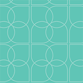
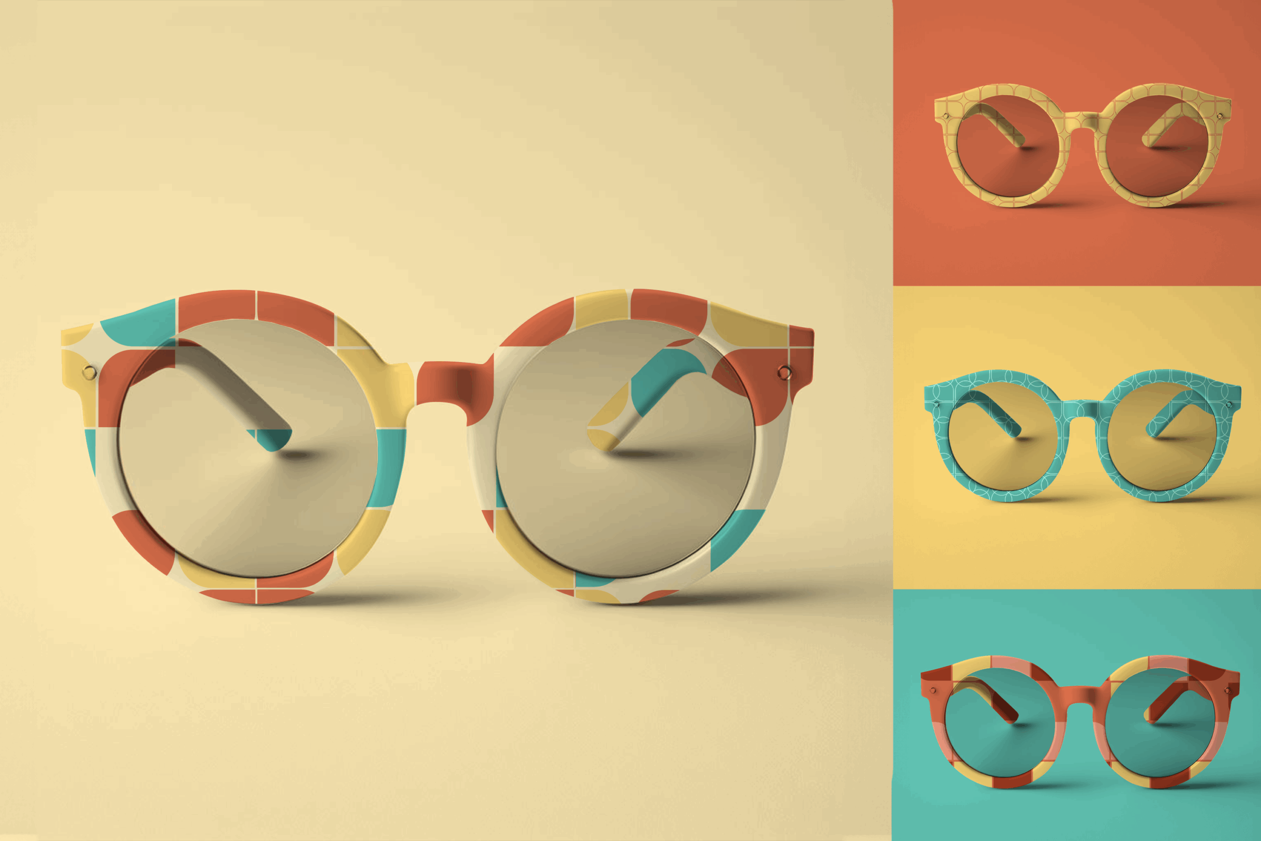
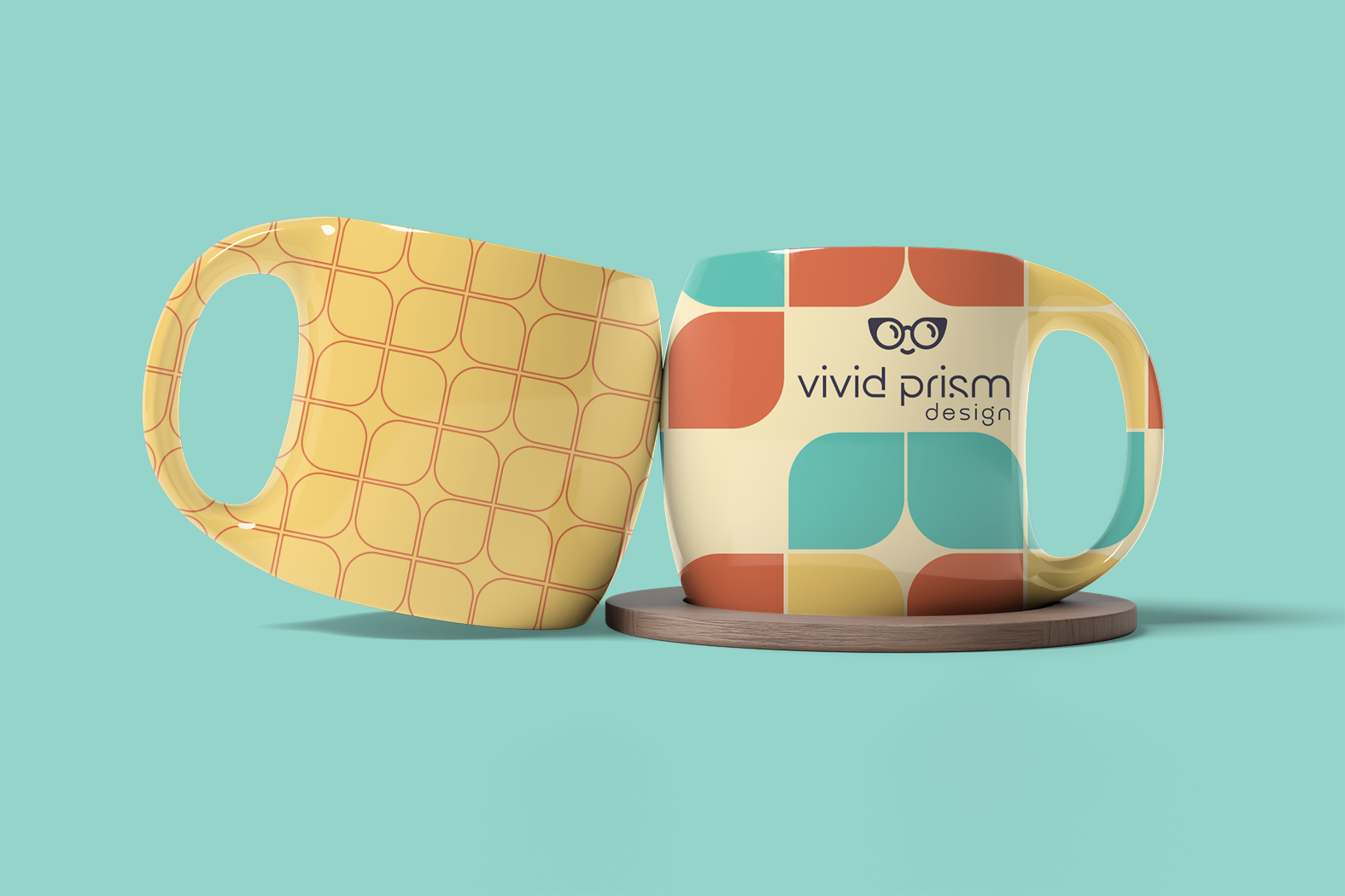
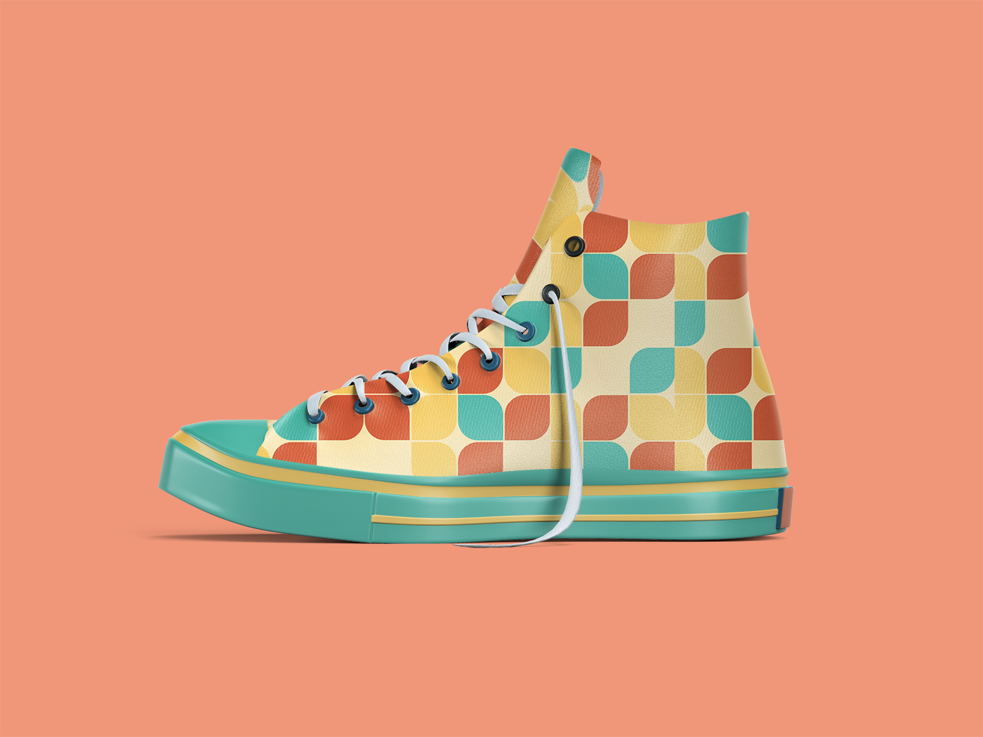
Codification of patterns and assets is crucial for brand consistency, even when the design is bright, bold, and eclectic. To have both energy and variety while keeping the various elements related, the core pattern shape is highly referential to the glasses in the logo.
This shape is the cornerstone of all brand patterns. It is manipulated in various ways—shifted, rotated and intersected—to provide texture across all applications. It appears outlined for light texturing that doesn’t interfere with copy, or in bold, full color for applications that demand maximum impact. This strategic restraint ensures that our exuberant authenticity is always backed by strategic precision.


Brand Explorations
This branding project exemplifies the core principle I bring to every client project: Clarity as Action through the Vivid Prism system. This framework—where Exuberant Authenticity meets Strategic Precision—is how I approach every branding challenge.
Too many brands overcomplicate their positioning to feel important. They hide behind corporate language and safe visual identities that could apply to anyone. The strongest brands strip away the unnecessary and reveal the essential: what actually makes you different and why it matters.
The Impact
The launch of the reorganized Vivid Prism identity establishes a new benchmark for success. The following metrics will be tracked to measure the long-term impact of improved clarity and strategic positioning:
The Light at the End of the Page
Stop scrolling and start solving. Whether you have a question or are ready to begin, drop me a line—I’m here to help guide you.